Benjamin Wong - UX Designer
Pain Tracking App.
for Take Heart Australia


Project Brief: Design an app which will allow patients in the Emergency Department to periodically input their pain scores,
and allow ED staff to view that information.
Duration: 3 weeks
Tools used: Paper & Pencil, Sketch, Invision, Google Forms
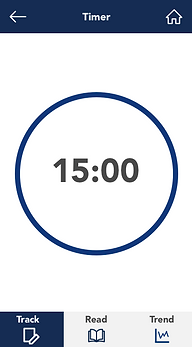
Summary: Patients tend to be confused when asked to score their pain from 1-10. We created a more visual scale with different qualifiers to help reduce that confusion, along with a timer to remind patients to update their pain levels. We added a way to input external factors that helped to reduce pain so that ED staff can make a note of it, as well as a graph which visually translates a patient's pain scores throughout their time in the ED.
The Problem
Take Heart Australia and the staff at Liverpool Hospital described their need for an app which will allow patients in the Emergency Department to input their pain levels at given intervals.
-
ED staff are simply too busy to regularly record pain intervals for patients - normally it is only taken when they are admitted.
-
The standardised 1-10 pain score is confusing and many patients are unsure where to score their pain.
The requirements of the app design were made clear by our client:
-
Patients should able to input their pain-scores at a time that is set by the ED staff.
-
The pain scale should be easy to interpret across a range of cultures and ages, as Liverpool hospital has a diverse range of patients.
-
Finally, ED staff should be able to search for and view a patient’s pain trend over their time in the hospital.
The Research
Interviews and findings
25 people who had previously been to the emergency department
Key patient findings:
-
Patients were not asked for their pain score after admission
-
Many were unsure of how to score their pain

17 Emergency Department Staff
Key staff findings:
-
ED staff want to get more frequent updates on patient’s pain scores
-
Surges in new admissions into the ED mean that staff are unable to continually get updates from patients
Personas
We crafted two key personas based on the trends found in our interviews.
Jae Chung - "The Nervous ED visitor" - Having been diagnosed with cardiac problems, Jae frequently visits the emergency room when she feels chest pain. She feels frustrated in the waiting room as she feels it is difficult to update staff on her level of pain during her visits and has nothing to do during the waiting times.
Kathy Davidson - "The Compassionate Nurse" - Kathy feels concerned when she is unable to keep track of all the patients in the ED as she does not want them to feel like they are being ignored, and wants to know if any alternative treatments can assist in their pain while they wait.
Pain Scales

I then examined different pain scales, and how they represent the information differently.
-
Many pain scales incorporated the use of colour and faces to help visually describe each number.
-
Others use actual descriptions at each number as well to help clarify the levels to the user.
Feature Prioritisation
Based on our client meeting and taking into consideration the timeframe that we have to work with, we created a list of "Must have" features that we wanted to represent in our prototype.

The Design
Initial design, testing and iterating

Users found the scale to be visually distracting, some noted the numbers were too small

Users found it difficult to tell which number on the scale was selected

Size contrast for selected number and changes to the wording for the descriptors
We tested our second iteration with staff at Liverpool hospital and received the following feedback:
-
Add a screen where users are able to note down if anything has assisted their pain since the last time they inputted their pain score
-
Add a "Distraction therapy" screen which could provide articles as a form of entertainment for the patient
Alternate designs and testing for the “what assisted your pain” screen.


Vs.

With this design, I tried to use the space a bit more creatively - I envisioned a patient in pain, so a larger selection area would make it easier to hit a specific option
A more traditional selection layout - this was favoured by the users that we tested with.
Boxes removed to simplify the design
It was suggested that the "Timer" and "Track" screens to be merged so patients can't input any additional pain scores until the timer reaches zero. This would avoid patients from spamming the system with pain scores.

Potential next steps
While the prototype was met with positive feedback from the clients following our final presentation, we felt that more features could be incorporated into the app in the future:
-
Rather than just representing articles for distraction therapy, the app could also include meditation exercises and even games.
-
The scope of the pain scoring app could be widened and used to track long-term pain outside of the hospital, potentially allowing GP’s to have a better understanding of chronic pain for some of their patients.